AEW Office Renovation – Part I
Posted on July 10, 2020
July, 2020
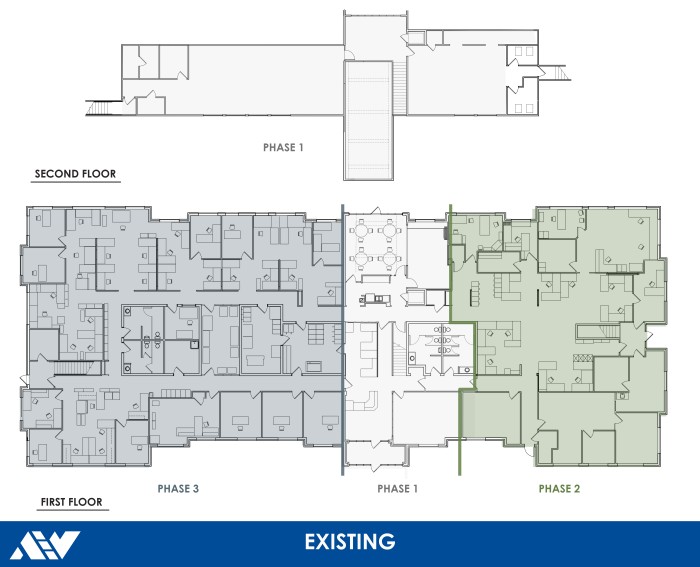
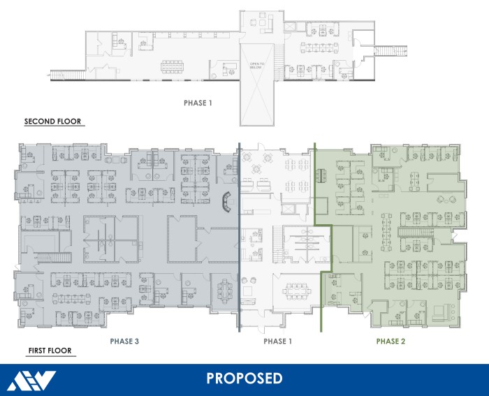
Many changes have occurred in our office in the past year. AEW is undergoing a complete interior renovation. Since we were still occupying the building (prior to Stay Home Stay Safe orders[1]) the renovations needed to happen in phases while we shuffled around the building. Phase One started in Fall 2019 and the final phase, Phase Three, is expected to wrap up by the end of this year. The renovations were needed to improve the way our groups work together, increase natural lighting, and enhance building flow and air quality. Our goal was to create a space that really reflects our culture here at AEW.
ISSUES
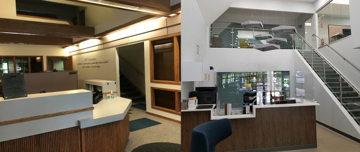
The Lobby and Reception area had many challenges. As the entrance and first glimpse of our company, it needed to be renovated first. We felt it was not an accurate representation of our company and our design capabilities. Reception had poor lighting and felt very closed in. There were also issues with noise in the space. Being the main entrance and main corridor in the building, it draws an assortment of foot traffic and conversation. Wood beams ran across the space at typical ceiling height with lights, even though the space is two stories tall. This made the space appear darker and closed in.
Not unlike any business or home, there was not enough space or storage. As AEW has grown as a company, the amount of space needed for desks has also grown. Work stations were comprised of different sized desks and layouts. The inconsistency could be perceived as unorganized, and left some employees with unequal work space. Most files, books, and other needed materials were stored on book shelves or filing cabinets. These took up a lot of space in the office and needed a better solution.
IMPROVEMENTS
Phase One
Phase One addressed the Lobby, Reception, Main Conference Room, Café, Lounge and the entire second floor. The main goals were to create more of an open concept office, with transparency and more natural light. New interior finishes including polished concrete floors, new carpet and paint, natural materials, and glazing. These materials were carefully selected to represent not only our company colors and branding, but to create a long lasting and timeless design for our space .The materials and patterns are selected to denote specific areas of use throughout our space. Different flooring materials including carpet and polished concrete are used for wayfinding. Polished concrete is used in our main corridors and walkways, while different carpet colors and patterns are used throughout the open workstation areas and private offices with border transitions to designate pathways throughout the space. Different pops of color and wall treatments are used in specific areas to highlight public and collaborative areas, to be used freely by all employees. These areas reflect not only a change in materials and color, but uses and noise levels as well.

The Reception area gained new built-ins, counter tops and desks. The adjacent stair wall was opened up and replaced with glass railing. This brings more light into the front office and allows the reception staff to see who is going up and down the stairs. The wood beams were removed for the full two-story height to be unobstructed. New lighting was added at the vaulted ceiling that, while being higher up than the existing lighting, is more effective for the space and front desk staff. To battle some noise in the large space, we added acoustic, geometric clouds above the front office desks. These clouds dampen the noise and add some visual appeal. The second floor was our survey department and storage. The storage area was opened up to Reception with a glass wall and converted into usable office space.
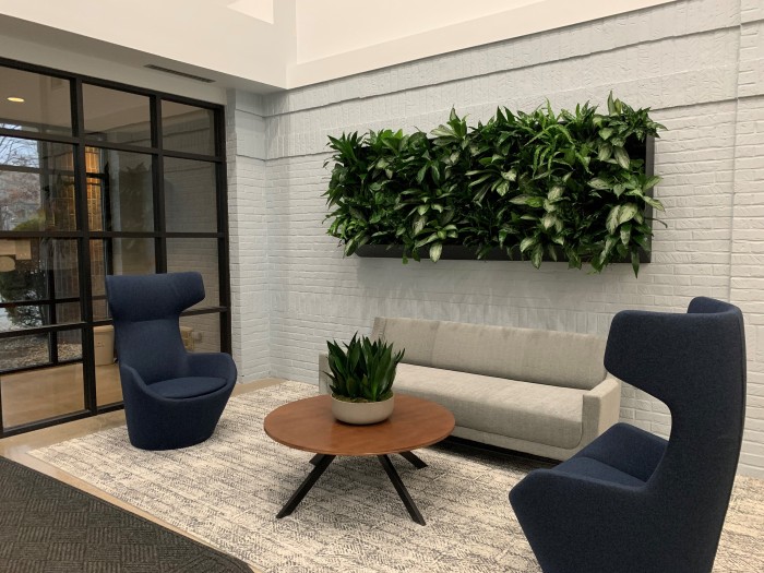
New office mates: Plants! We’ve added real plants to many of our spaces. The most drastic is the living wall in our lobby. The plants also help with the acoustics of the space, while adding color and visual interest on an otherwise bare wall. Plants in an office are not just an accessory, they provide may benefits. Plants clean the air, reduce sickness, improve productivity, and reduce noise.[2]
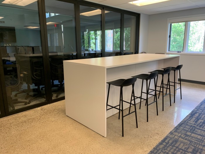
We revamped our café with new cabinetry and appliances for everyone in the office to utilize. A snack bar and stools were included as a chance meeting space, or a place to eat lunch. The existing lunchroom was opened up to combine with a conference room, to create a lunchroom that can accommodate both everyday lunches and lunch and learn presentations and company events. This space also features a living wall to dampen noise, as well as a folding glass partition wall, to allow larger events to spill into surrounding office spaces.
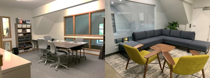
All new furniture. New seating in our lobby and loft meeting space promote the casual or spur of the moment meeting (and are seriously comfortable too). New seating in the café included low tables and chairs, booth seats, and hi-top tables with stools to serve the room’s many functions. Integrated storage within new collaboration spaces. Book shelves and file cabinets can take up a lot of usable floor space, so we selected furniture that is functional for meetings and other types of collaboration, all while fulfilling our storage needs.
Phase Two
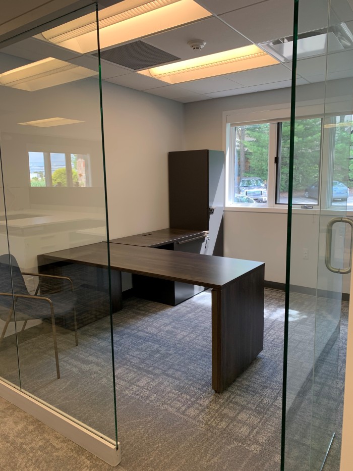
Phase Two of the renovation is the entire East wing of the building. This part of the renovation encompasses many offices and departments. All private office walls were replaced with glazing to allow more natural light to permeate interior spaces. There is much collaboration in our office. Architects are in constant collaboration with each other, as well as with civil and structural engineers to create well developed projects; it’s how we work. We needed to update our space to improve how we work. New workstations featuring lower partition walls and adjustable height desks are found throughout the building. When desks have a typical size and arrangement, it is easier to configure them together and gives everyone an equal amount of space. Having a bigger desk is not always better, it usually just equates to having more stuff. Adjustable desks allow users to sit or stand, with a push of a button, to the height that feels comfortable for the task at hand.
Phase Two is nearly complete. The full renovation is scheduled to be finished before the end of the year. Check back later for Office Renovation – Part II!
